

Art Chantry Exhibition design
For this project, I was tasked with creating hypothetical exhibition branding for a graphic designer of my choice. I chose Art Chantry, who is known for his edgy and grungy concert posters. It was challenging for me to think of how to include the works of Art Chantry while still inserting my own flair. It was also a challenge because his style is so different from my own, and he has also evolved his style a lot over the years. This project helped me to learn about the research and development process of graphic design for a client.
I named the exhibition “Trash Talks” because of Art Chantry’s tendency to use actual trash in his designs, which are used to communicate visually. He cuts out found imagery and text by hand and remixes them into his own work.
The deliverables included a brochure, banner design, and an Instagram post layout.
For my brochure, I thought it would be appropriate to have it fold out and turn into a poster so that people can take it home instead of throwing it away.

Brochure cover layout. I wanted for it to fold out into a poster so people can hang it up instead of throwing it away.
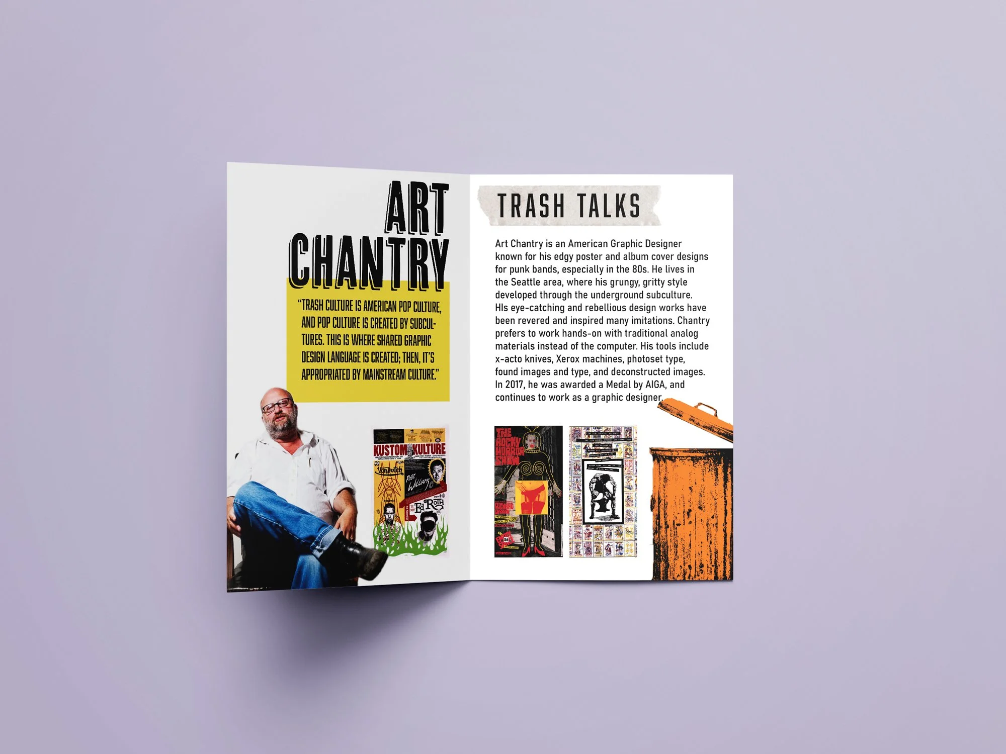
Brochure inside layout, with a quote from Art Chantry and a blurb about the designer.

Mockup of a banner for the exhibition, including 4 of Art Chantry’s poster designs.
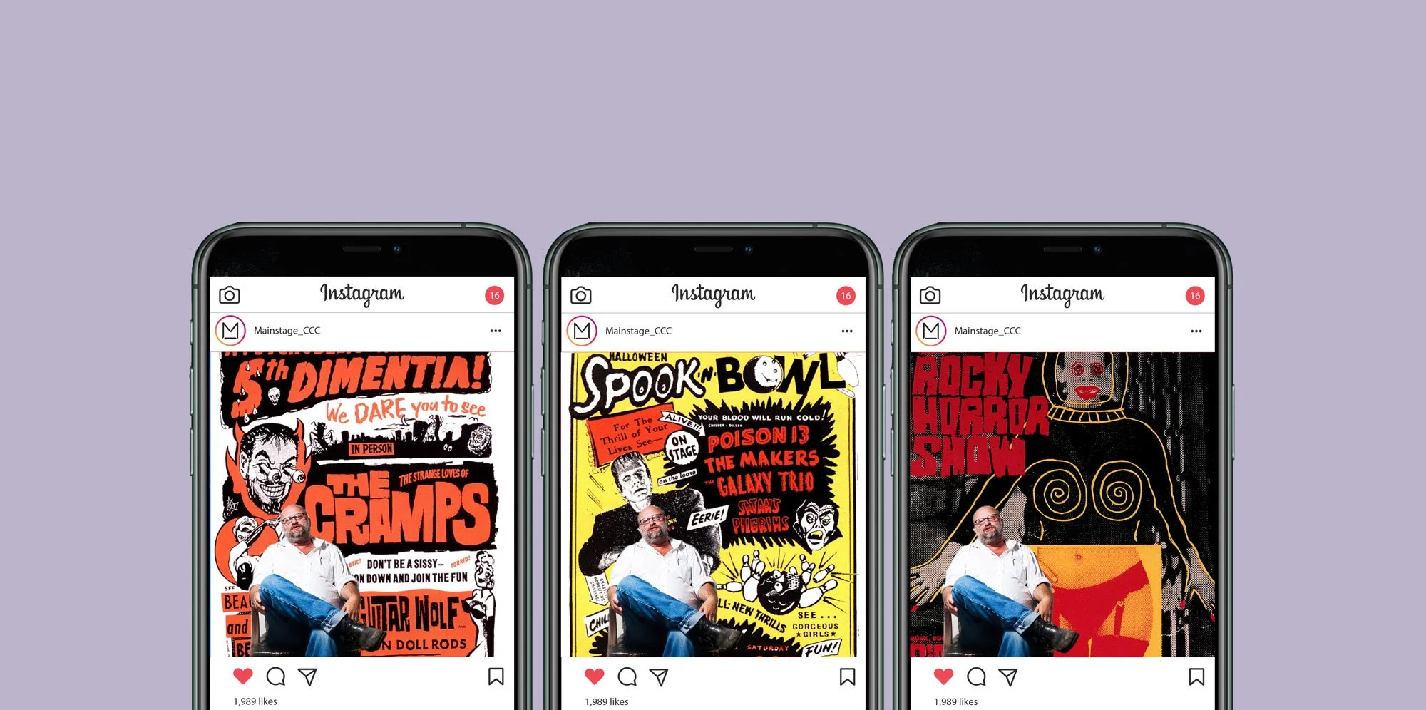
Instagram post layouts for the exhibition, which plays with the scale of his posters.