
Manifest design showcase branding & signage
Every year, Columbia College Chicago has an Arts Festival that showcases the works of graduating students. The Design Department asked several students to design a proposal for branding and signage for the department’s showcase. Each of us submitted our own proposal, and although my proposal ended up not getting chosen for the showcase, it was a close contender.
The Design Department is made of three separate departments, which are Graphic Design, Illustration, and Interior Architecture. In my design, I wanted to highlight both the unity and distinctions between the three departments.

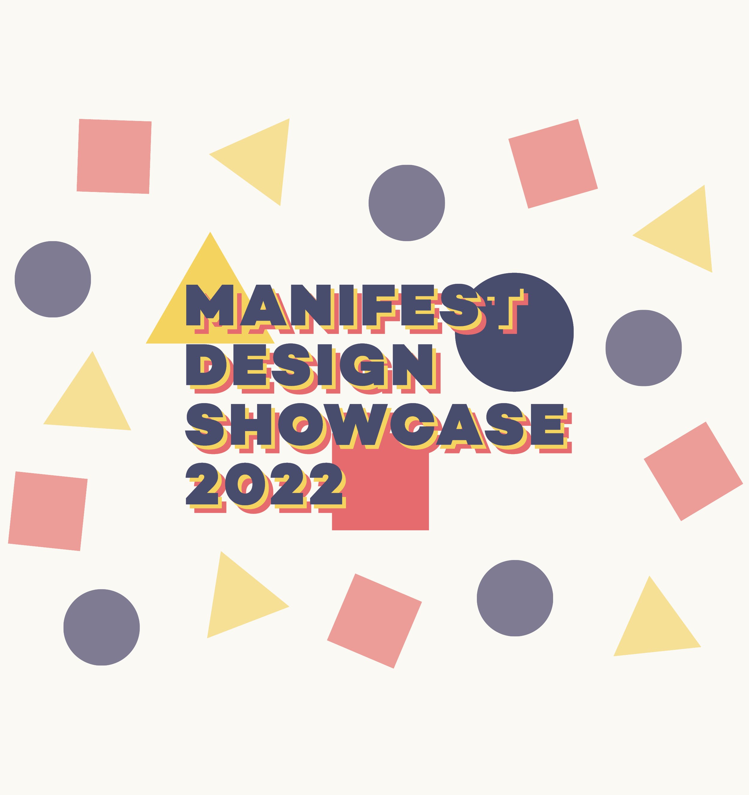
The three colors of text stacked on top of each other represents the three Design Departments, Graphic Design, Illustration, and Interior Architecture. All of the branding uses the typeface of the Design Department’s branding, Campton. Each Department is represented by three elements: a color, shape, and icon.

These are the graphic elements for representing each department:
Graphic Design is blue, circle, and a computer.
Illustration is yellow, triangle, and a pencil.
Interior architecture is red, square, and a house.

The front window would have the main event branding logo, then the locations and icons for each department. As a small detail, the bullet points consist of each department’s shape.

The column treatment is similar to the front window treatment, but I added some of the shapes to bring attention and visual appeal.

This is an example of what a glass window would look like for an interior architecture exhibit. It includes the main branding, the Interior architecture branding elements, and the names of students (I used the names of last year’s students as a placeholder).

The two story wall for the graphic design exhibition would have the design showcase branding in the corner, and the graphic design elements underneath. It should be large enough so that it is recognizable as a design exhibit, without overpowering the student works on the wall.

This is a simple landing page design I created for the virtual version of the exhibition, which would be on a website.