
BASIS Can packaging design
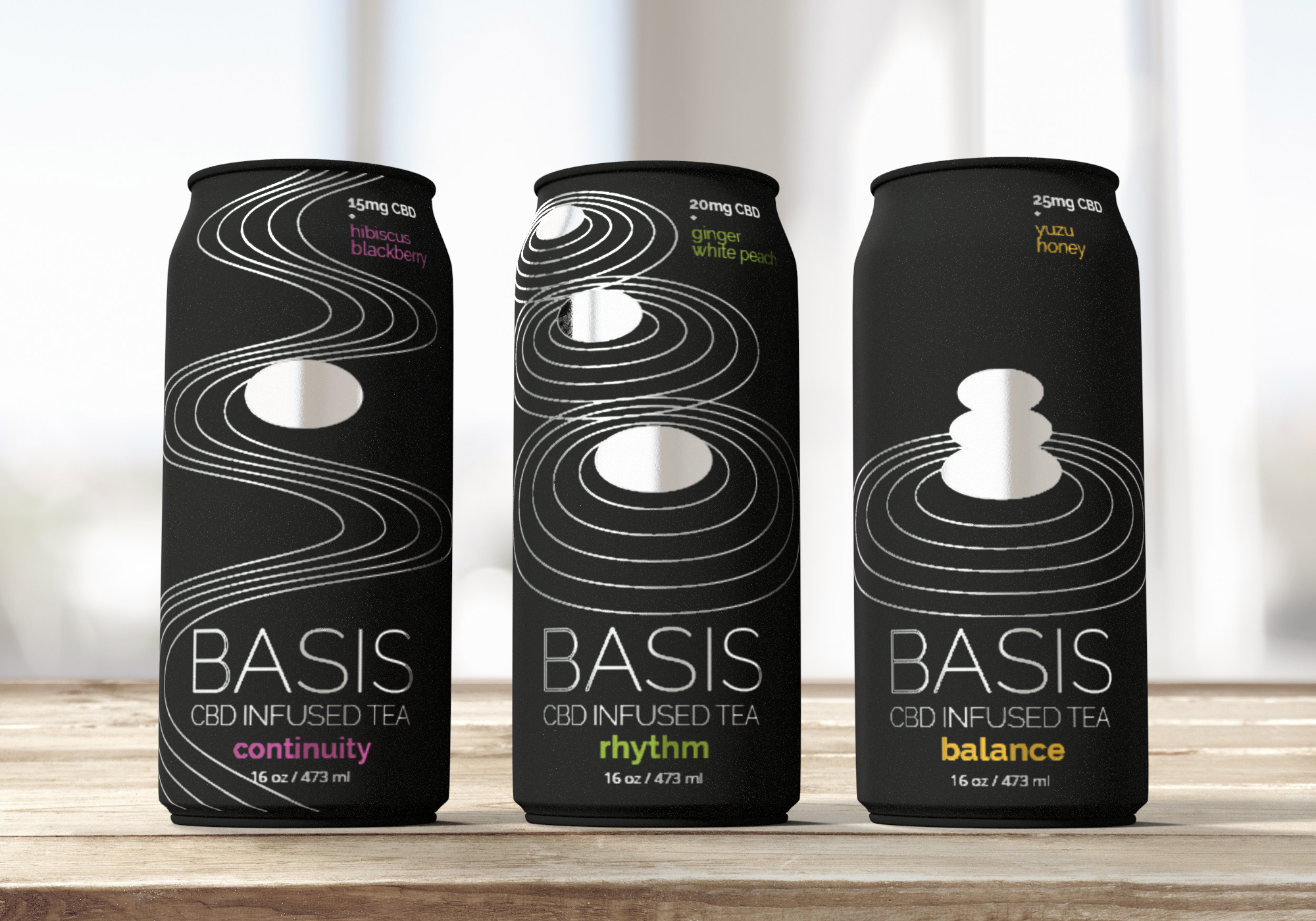
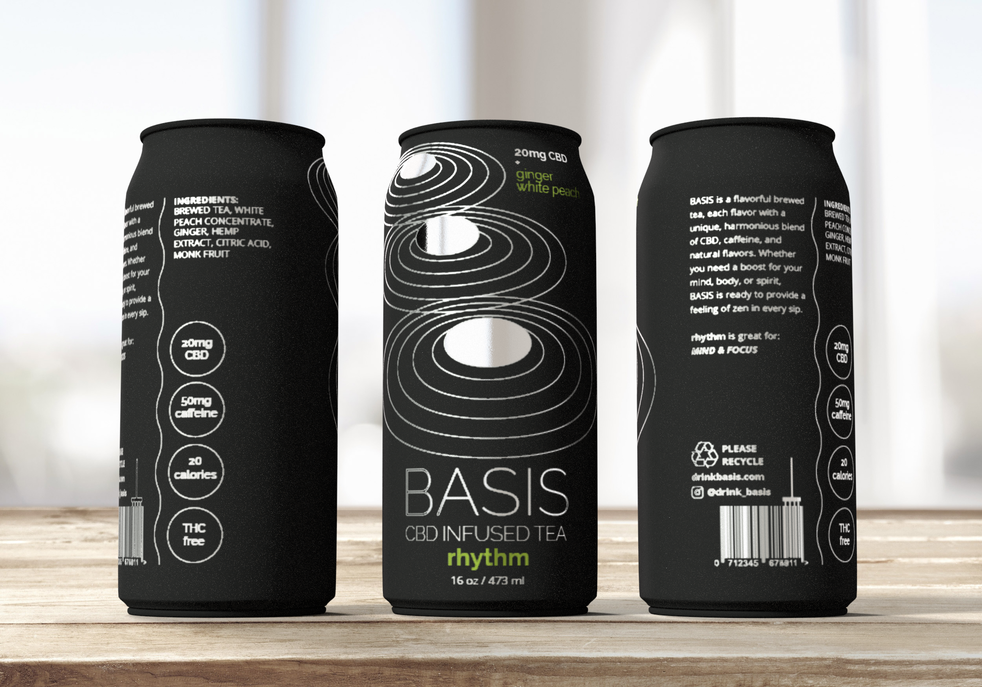
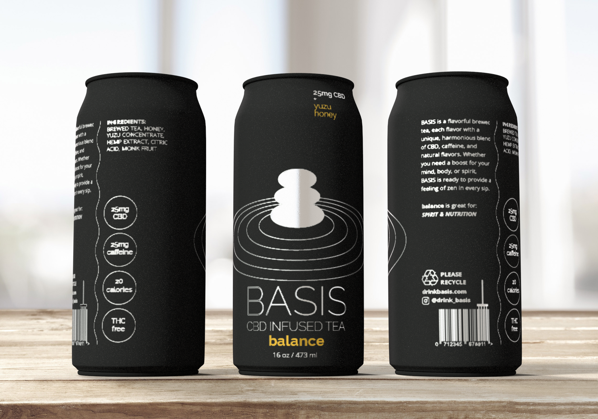
For this project I was asked to develop a simple brand identity and packaging design concepts for a brand called, “BASIS”. This brand would offer 3 different beverages: RHYTHM (for focus & mind), CONTINUITY (for energy & body), and BALANCE (for nutrition & spirit).
My goal was to make the three cans recognizable and distinguishable both individually as flavors and together as a brand. Another goal was that the brand should align with the target consumer’s values and appeal to them visually.
I was tasked with coming up with the branding, design, marketing material, flavors, ingredient formula, and basically everything except for the name "BASIS" and the flavor names (rhythm, continuity, and balance).
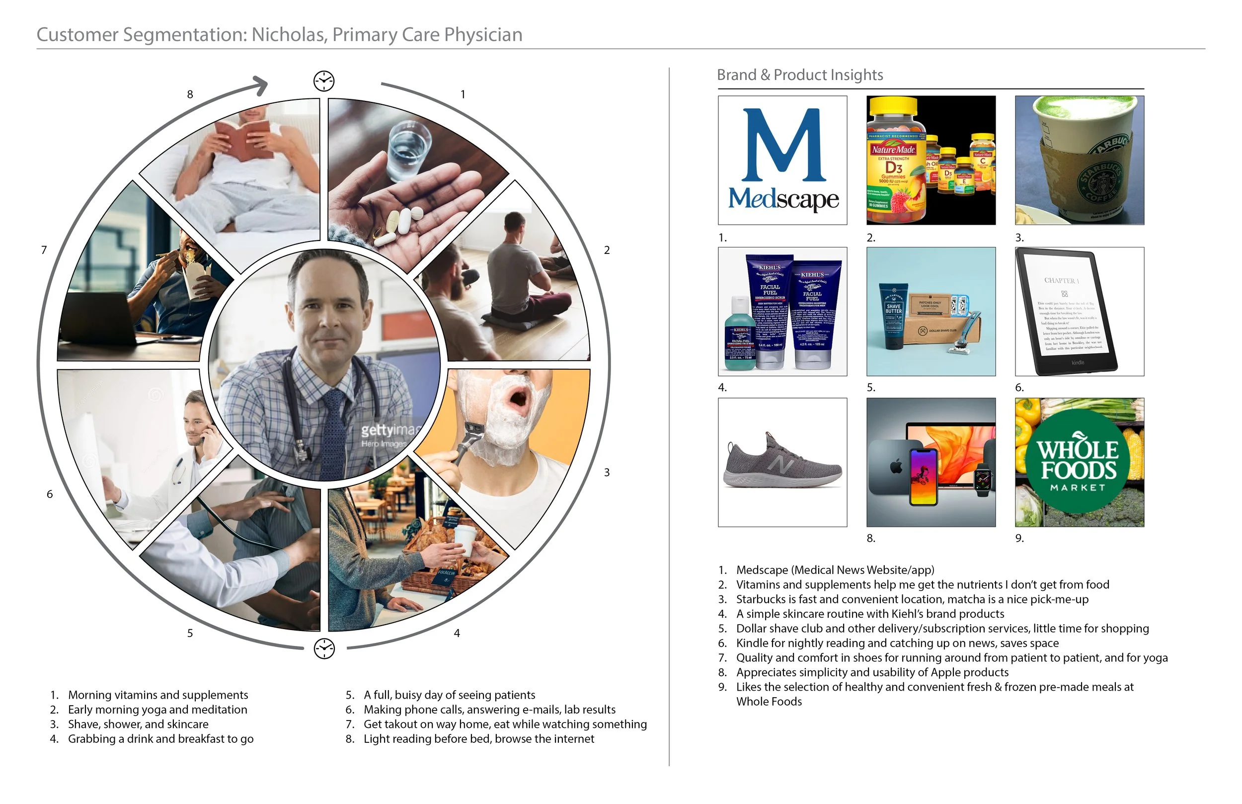
This was my target consumer’s persona. He is a middle aged doctor who lives alone and sees patients all day.

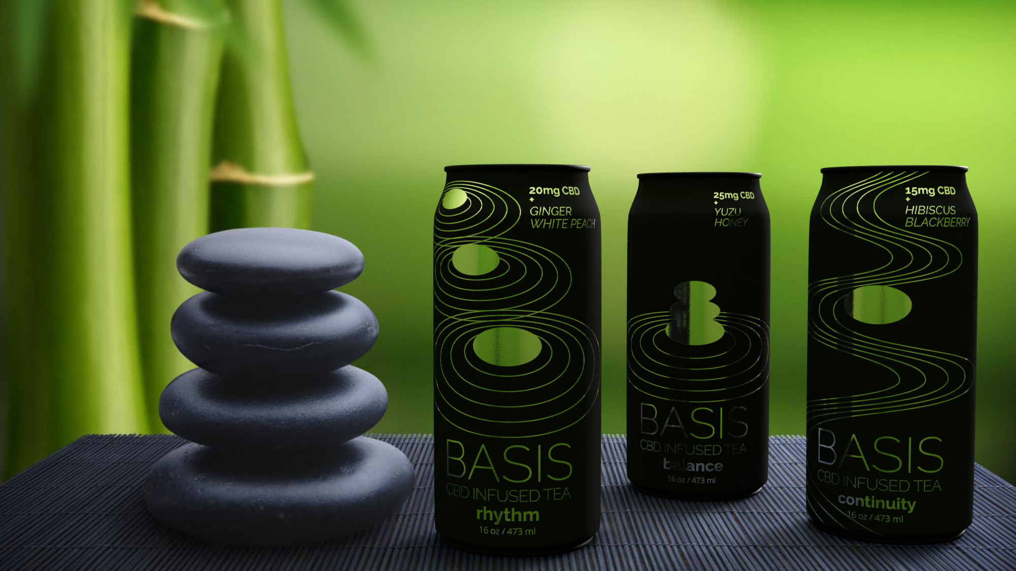
This is my initial concept board, where I drew my inspiration from. I was inspired by Zen garden sand and rocks, because I wanted my drink to deliver a sense of tranquility and a clear mind.
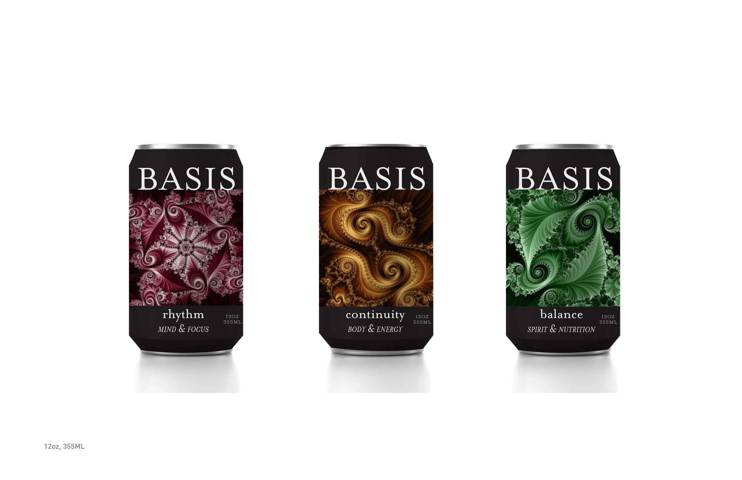
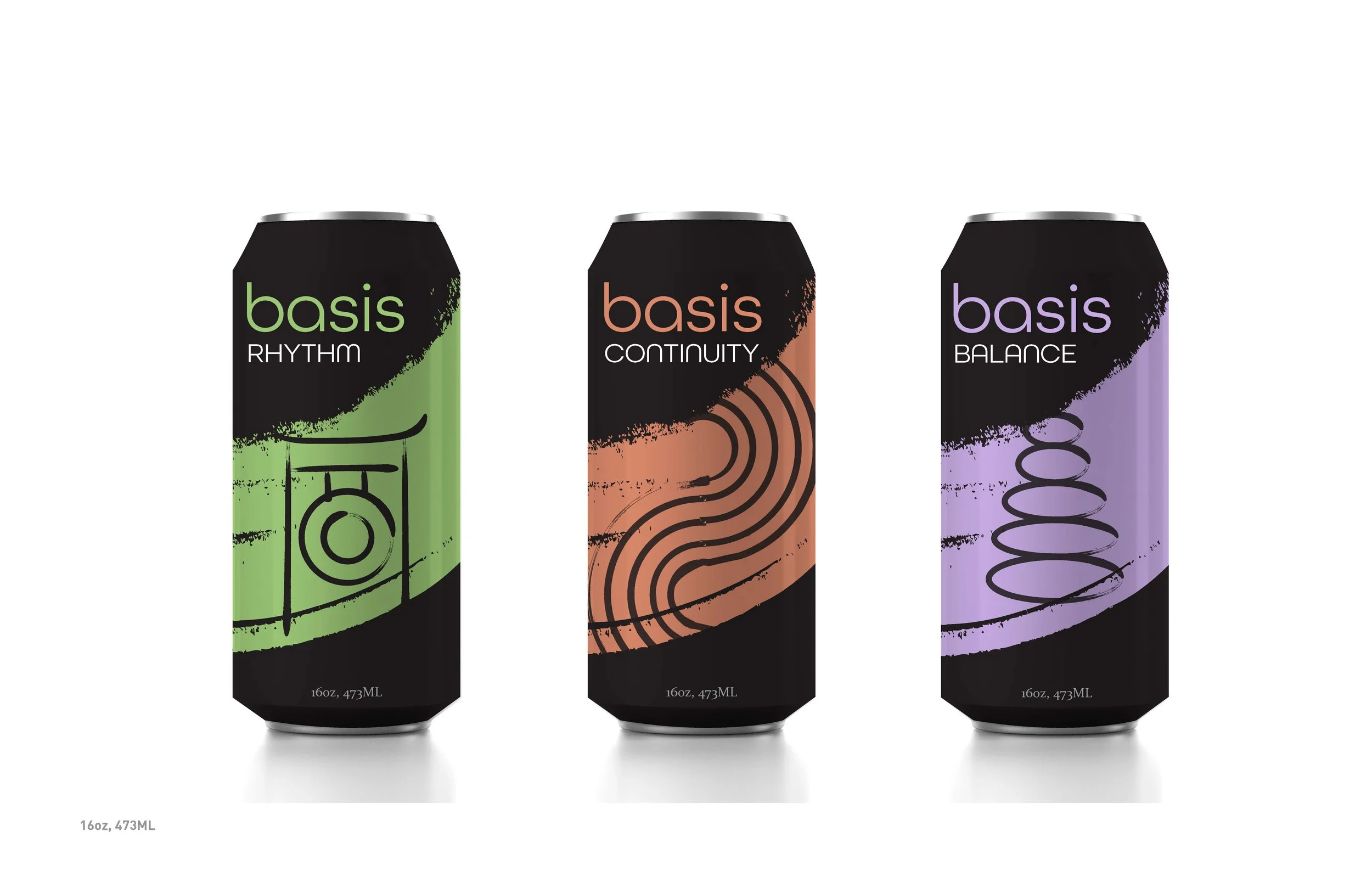
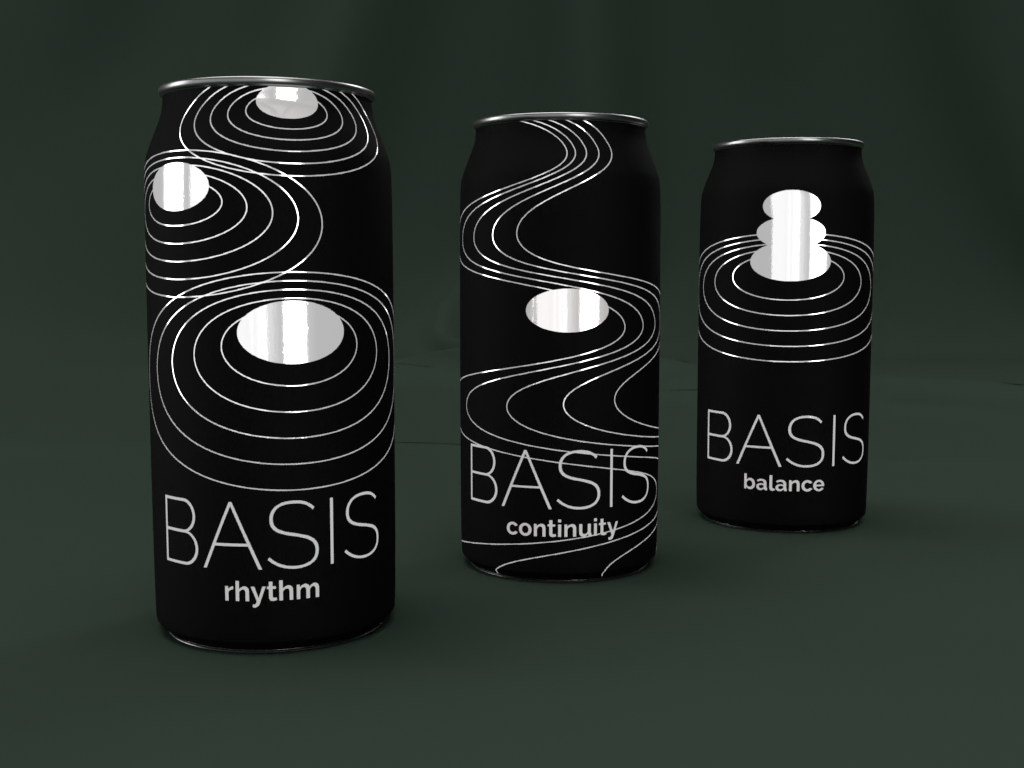
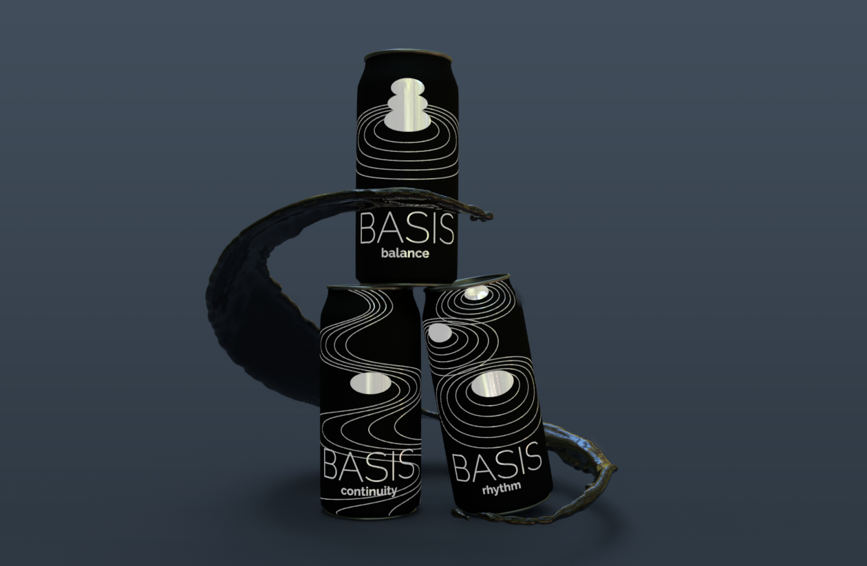
These are some early concepts and renderings that show the progression of the design.
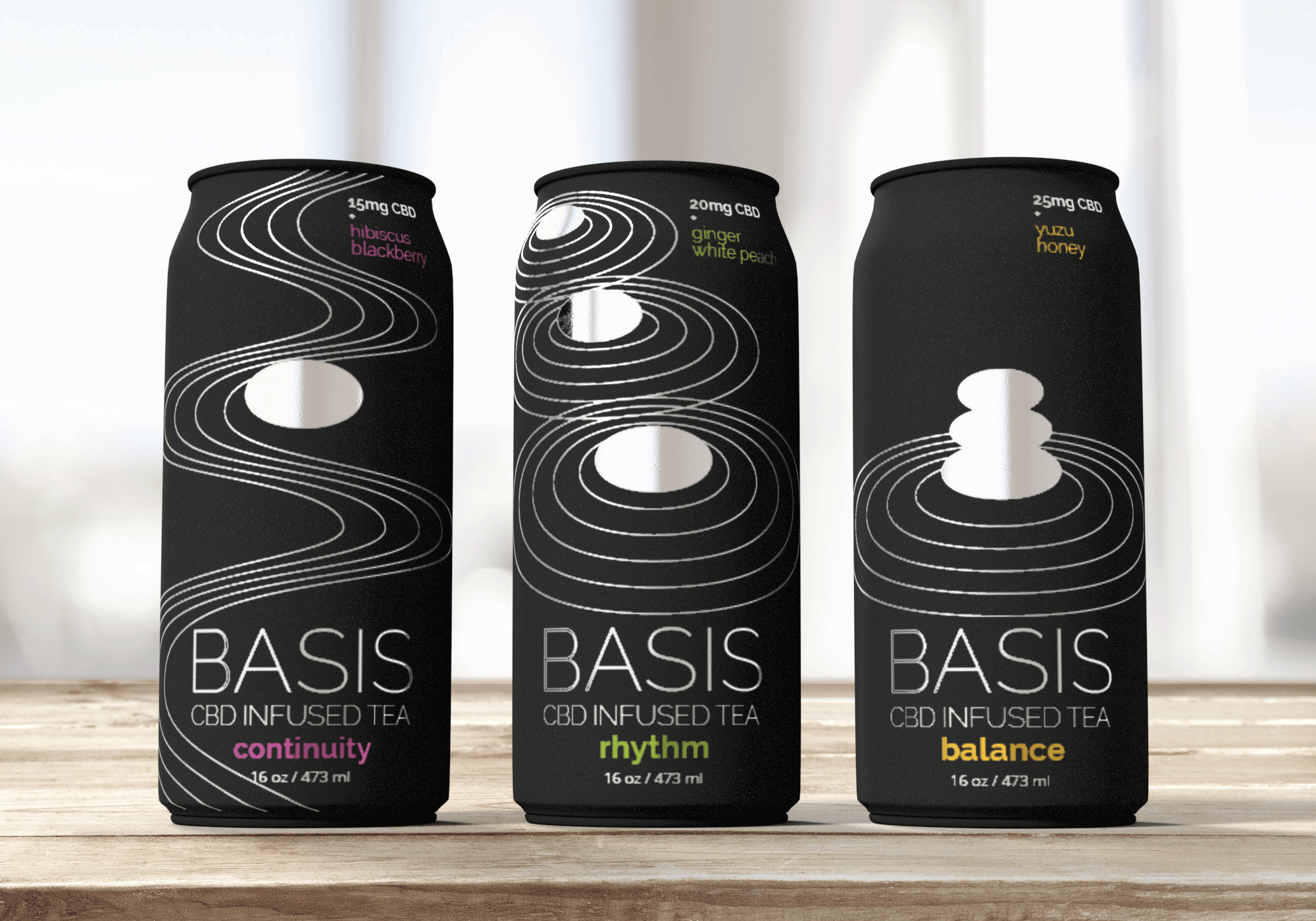
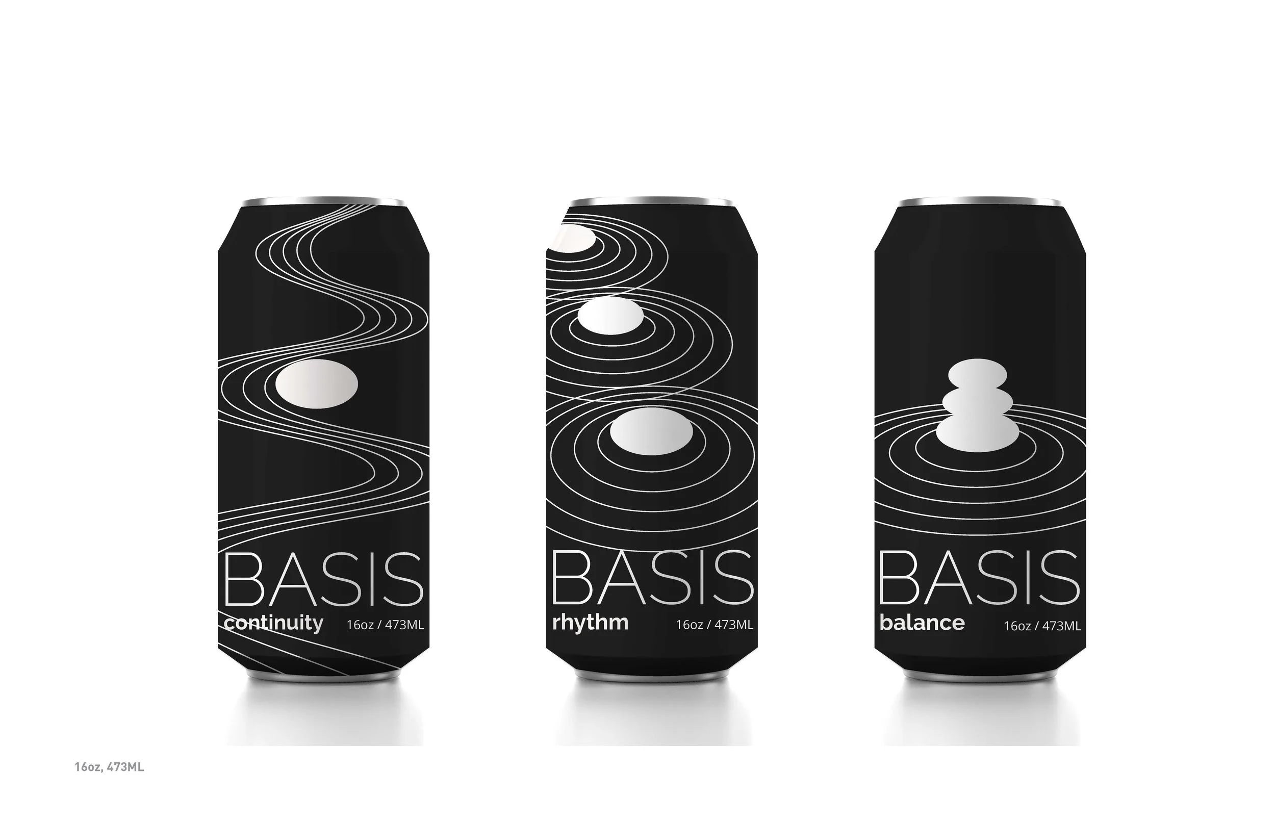
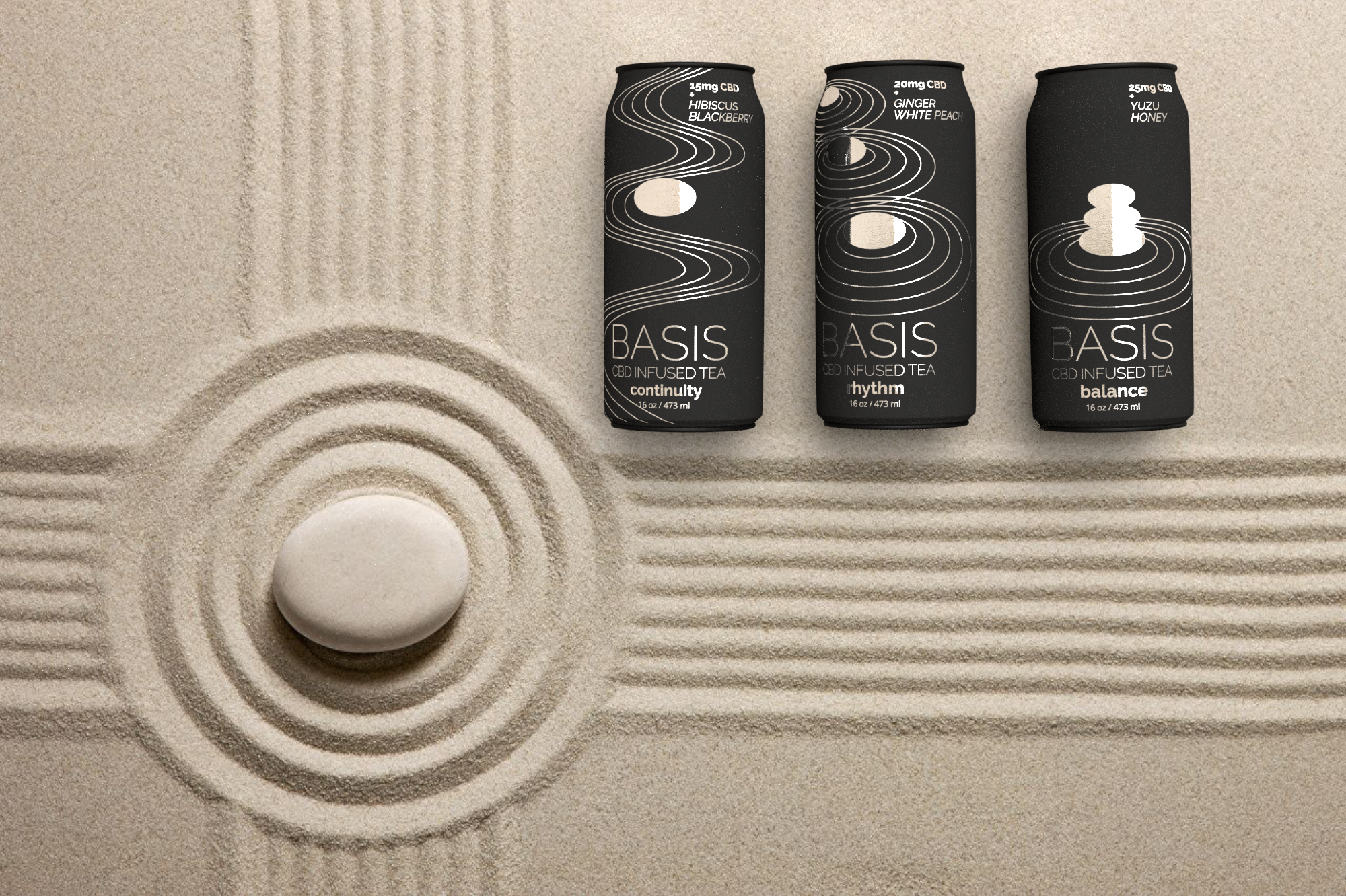
My final can design features a matte black can with metallic graphics. I decided to make the drink a CBD infused tea (with caffeine). Each drink features a different ratio of caffeine to CBD to give you the feeling that is desired.
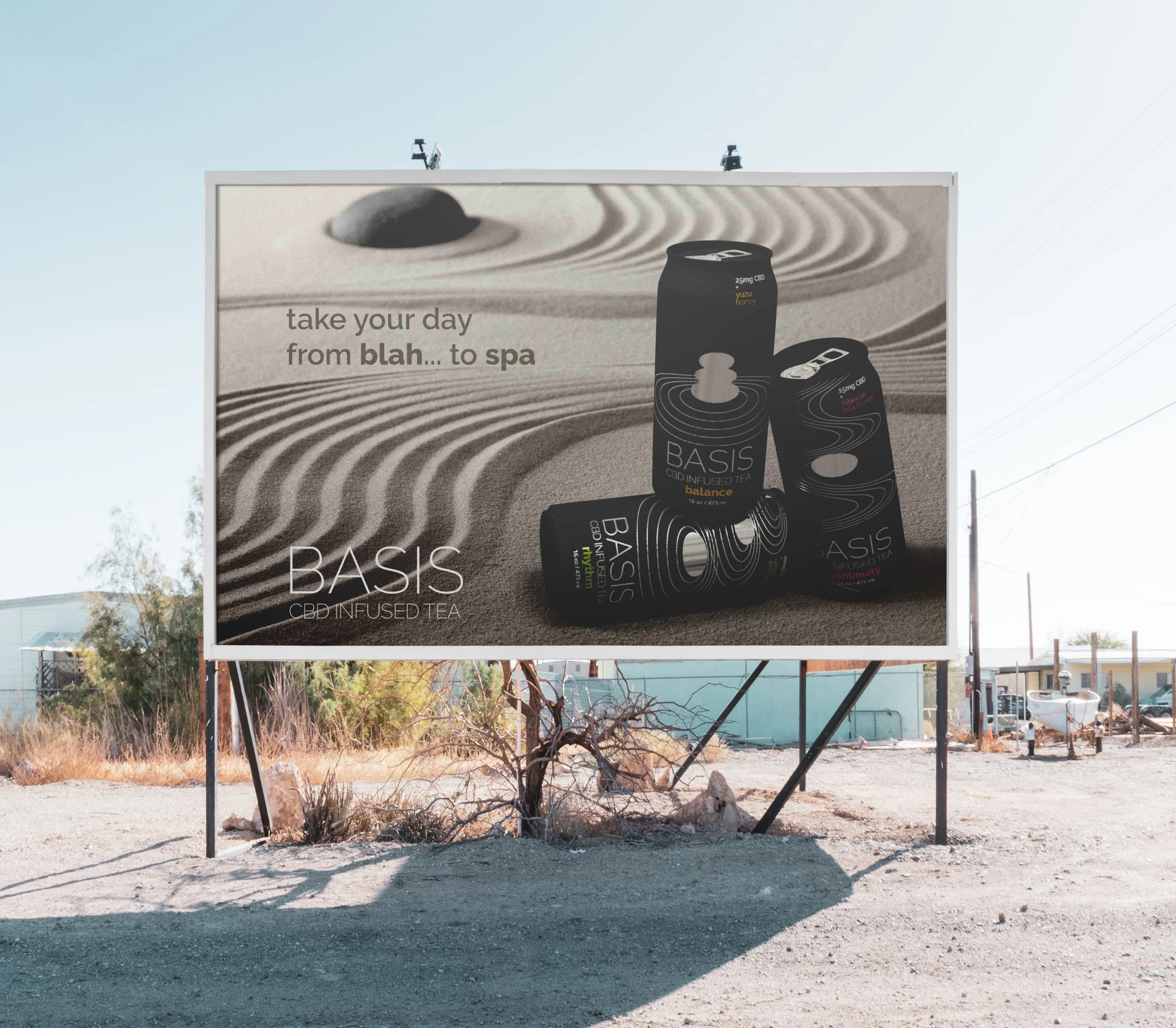
I created some promotional material by rendering the cans in Adobe Dimension, then adding text to it. This is an example of a billboard advertisement.
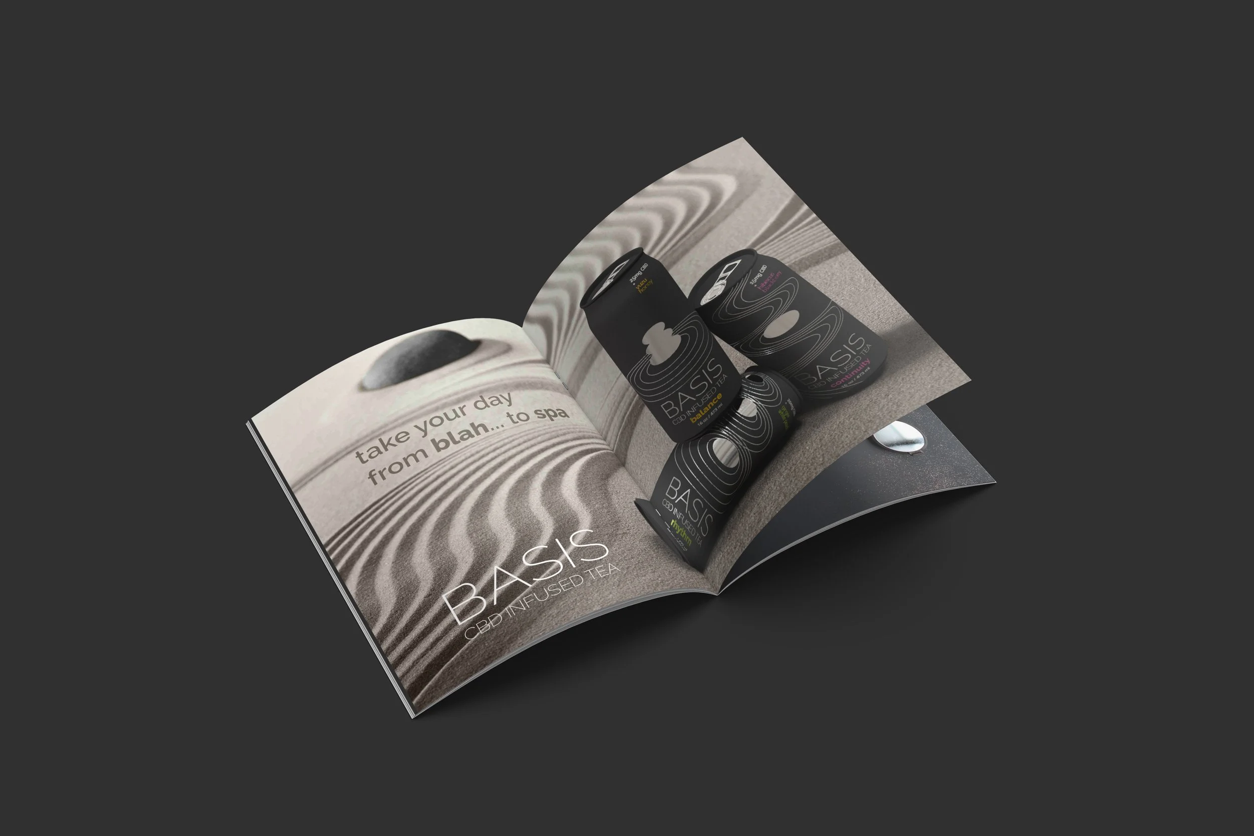
This is the same advertisement placed in a magazine spread.
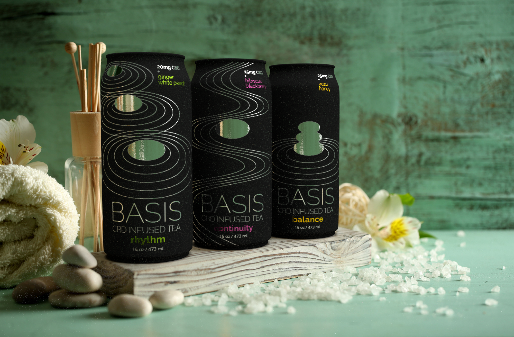
This is another promotional image, that focuses on the tranquility and self-care aspect of the drink.
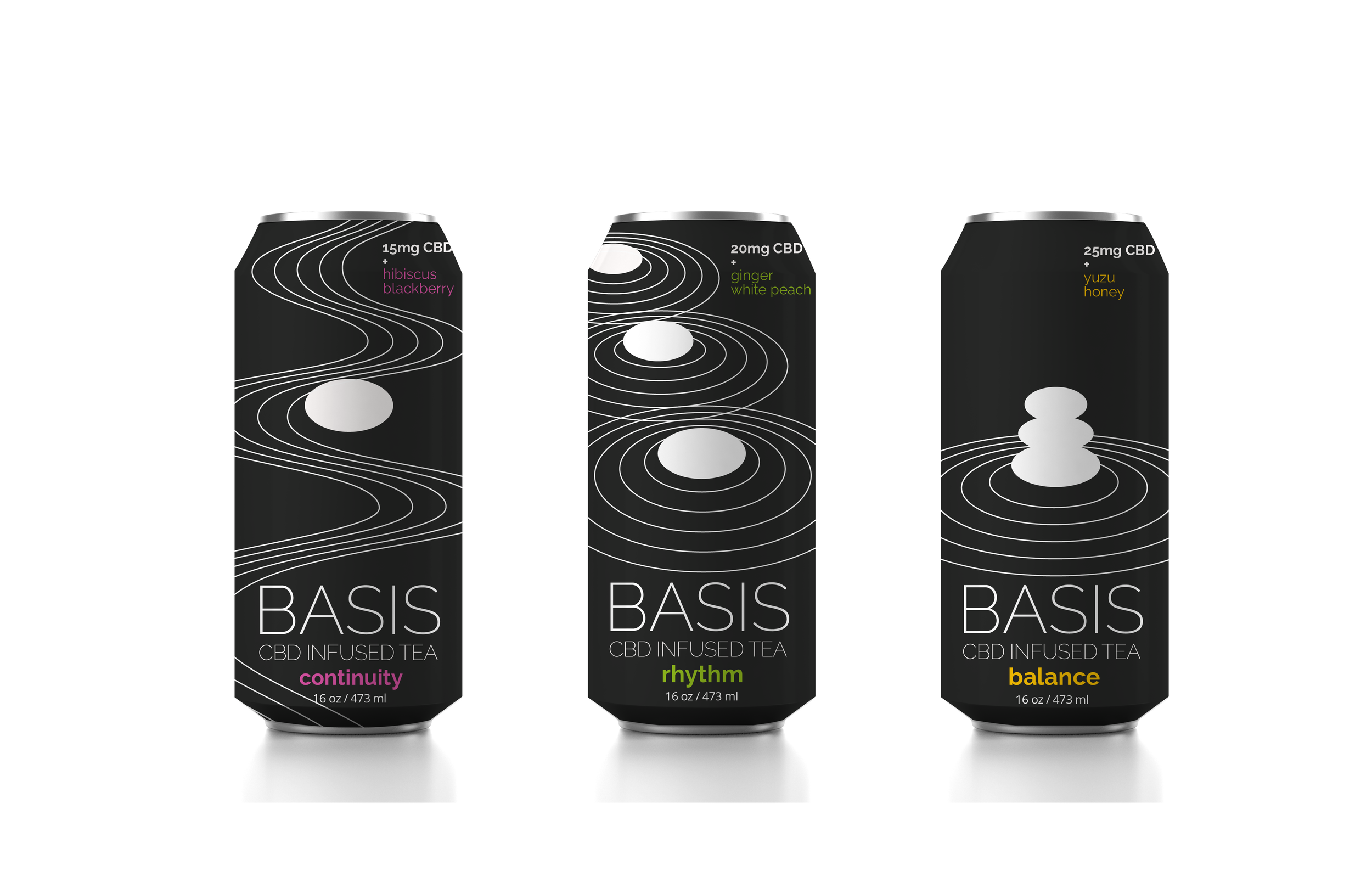
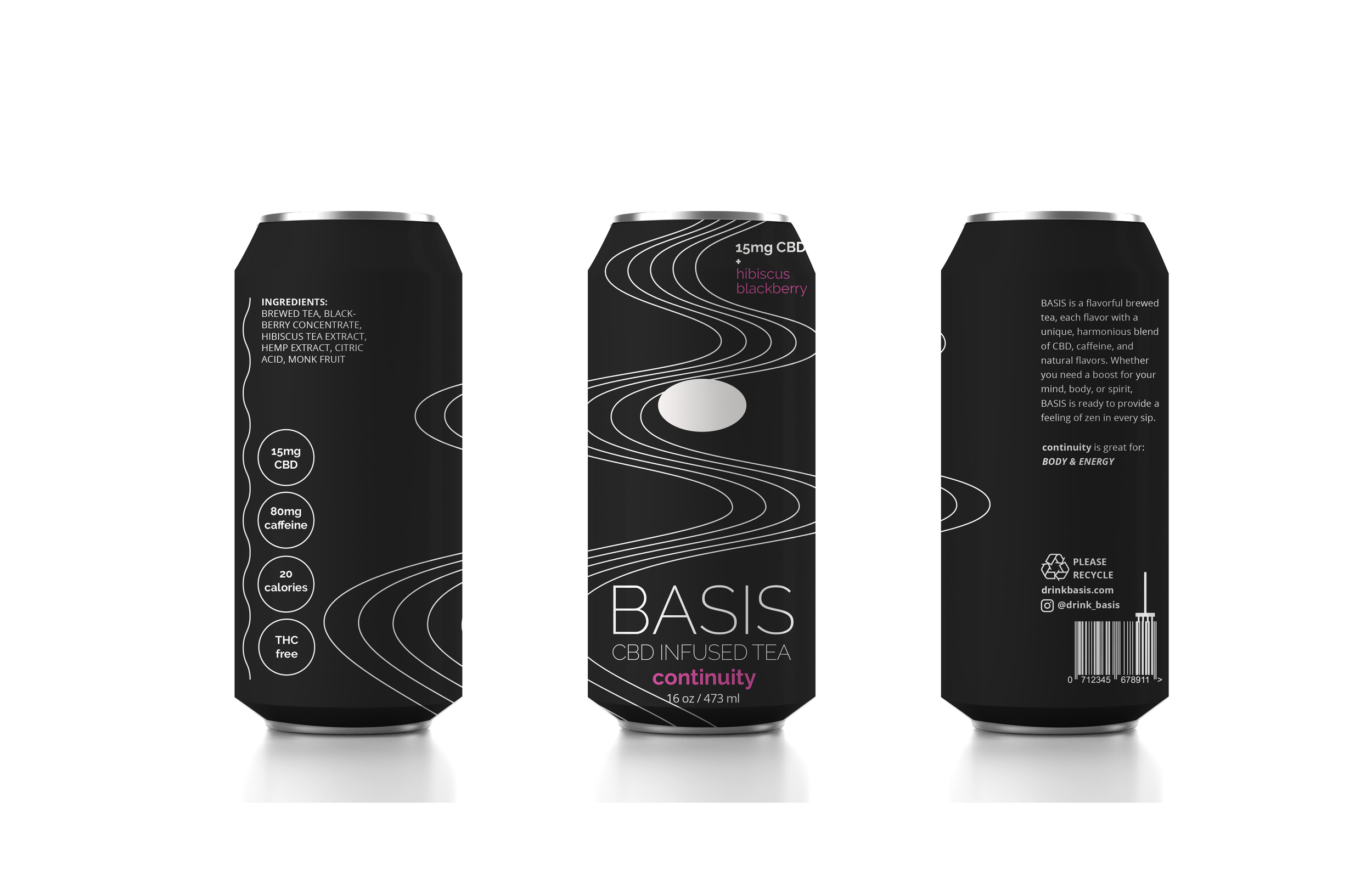


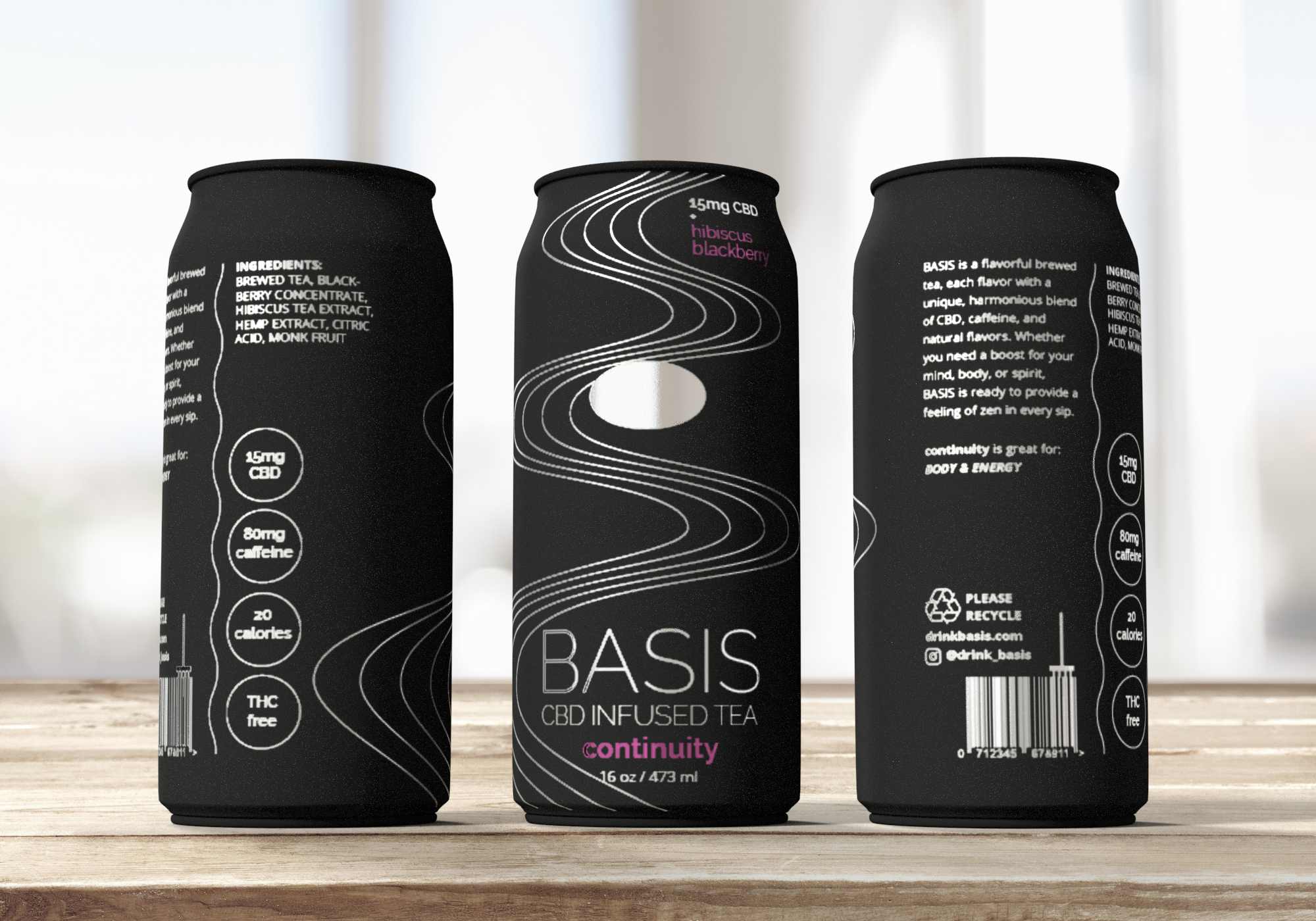
Final can designs in detail as 2D concepts and 3D renderings.